ShopDreamUp AI ArtDreamUp
Deviation Actions


Description
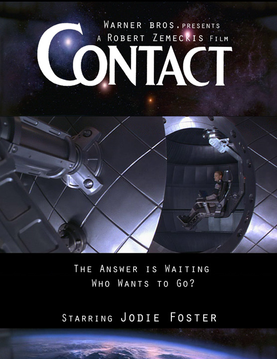
This was a class assignment. We were to pick a movie and redesign the movie poster as if it was going to be re-released. I love this movie and was trying to recapture the beauty and tension.
Image size
556x720px 134.1 KB
© 2005 - 2024 Diana-Huang
Comments7
Join the community to add your comment. Already a deviant? Log In
I landed here from a wormhole. Lovely composition even when it lacks golden ratio. Instant fav. 